
Men United
A brand identity project focused on faith, strength, and creating a sense of unity and belonging.
Overview
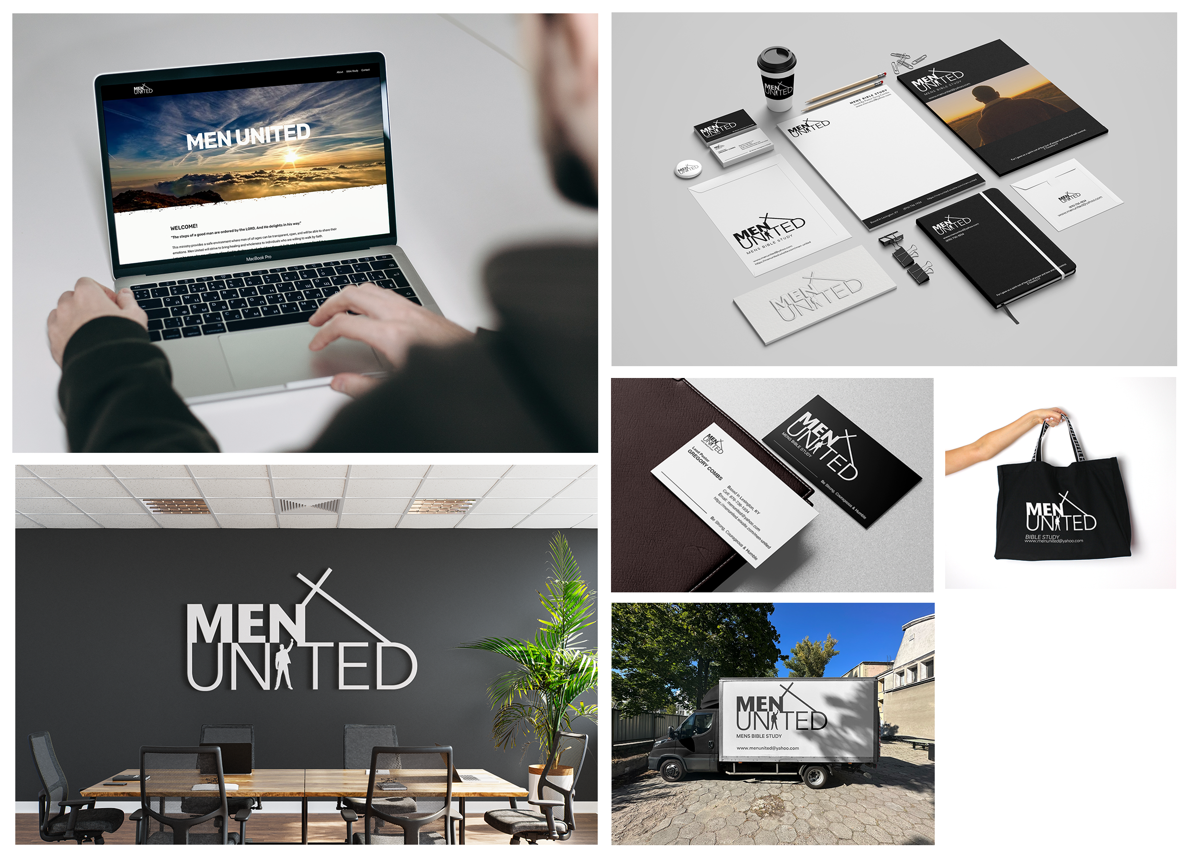
Men United was a client branding project created for a newly established men’s Bible study group focused on faith, fellowship, and personal growth. The goal was to develop a complete visual identity that would communicate the organization’s mission while creating a welcoming and recognizable presence within the community. The project included logo design, website design, business cards, stationery, branded merchandise, and vehicle branding, demonstrating how the identity could be applied consistently across both digital and physical touchpoints.
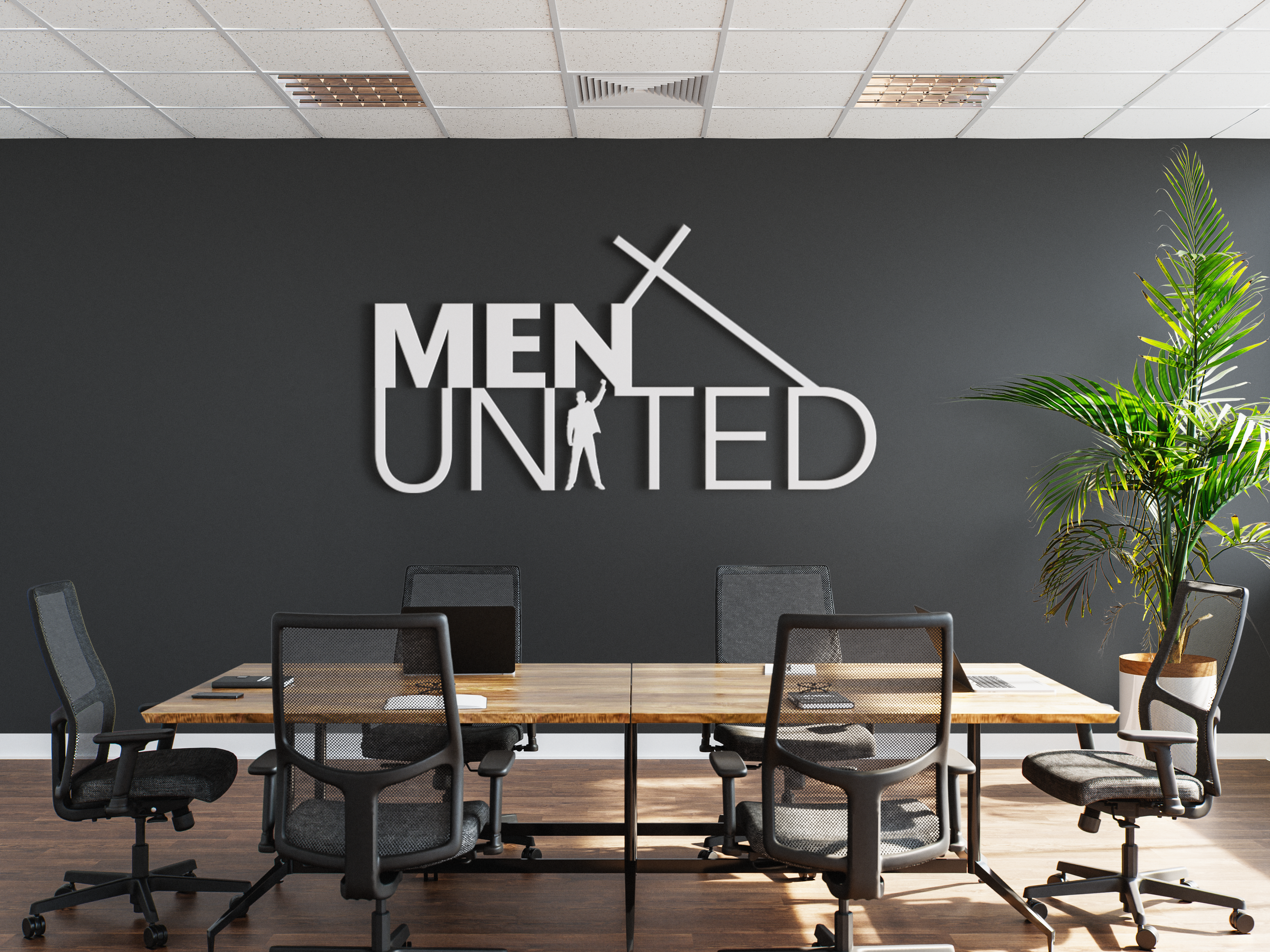
The logo presentation introduced the visual direction for Men United, exploring how typography and design elements could come together to create a clear and meaningful identity for the organization.
The Challenge
Starting without an existing brand identity, Men United needed a visual system that could introduce who they were and communicate their values clearly.
The challenge was creating a brand that represented strength and faith while remaining welcoming to men of all ages and backgrounds.
The visual system needed to be:
- Strong while remaining approachable
- Meaningful without becoming overly complex
- Flexible across digital, print, and physical applications
The project focused on creating a brand that represented connection, purpose, and community.
Research & Discovery
Research focused on understanding how faith-based organizations communicate trust, belonging, and shared values through visual identity.
Several key insights guided the creative direction:
- Strong identities are often built around simple, memorable symbols.
- Clear typography helps create recognition and consistency.
- A welcoming visual approach can communicate community and connection.
- Flexible design systems allow organizations to grow across multiple platforms.
These insights shaped a visual direction centered on clarity, strength, and unity.
Brand & Strategy
The identity was built around three core values:
Faith
The cross element reinforces the spiritual foundation of the organization.
Strength
Bold typography and a confident structure communicate purpose and commitment.
Unity
The human figure within the wordmark represents individuals standing together as one community.
The goal was to create a brand that felt masculine and confident while remaining open and welcoming.
Design Process
The Men United logo was developed around a meaningful visual concept.
The words MEN UNITED are arranged on two lines to create a strong and balanced structure. Within the word UNITED, the letter “I” becomes a human figure with a raised hand, representing confidence, faith, and standing together.
A cross positioned above and leaning into the word MEN reinforces the connection between faith and brotherhood.
The simple design was created to help the logo remain recognizable and flexible across different uses.
Visual Identity System
A black and white color palette was selected to create a timeless and flexible foundation.
The system focuses on:
- Strong typography
- Clean layouts
- Consistent spacing
- Simple visual communication
The identity was designed to work across websites, printed materials, merchandise, and vehicle applications.
Applications
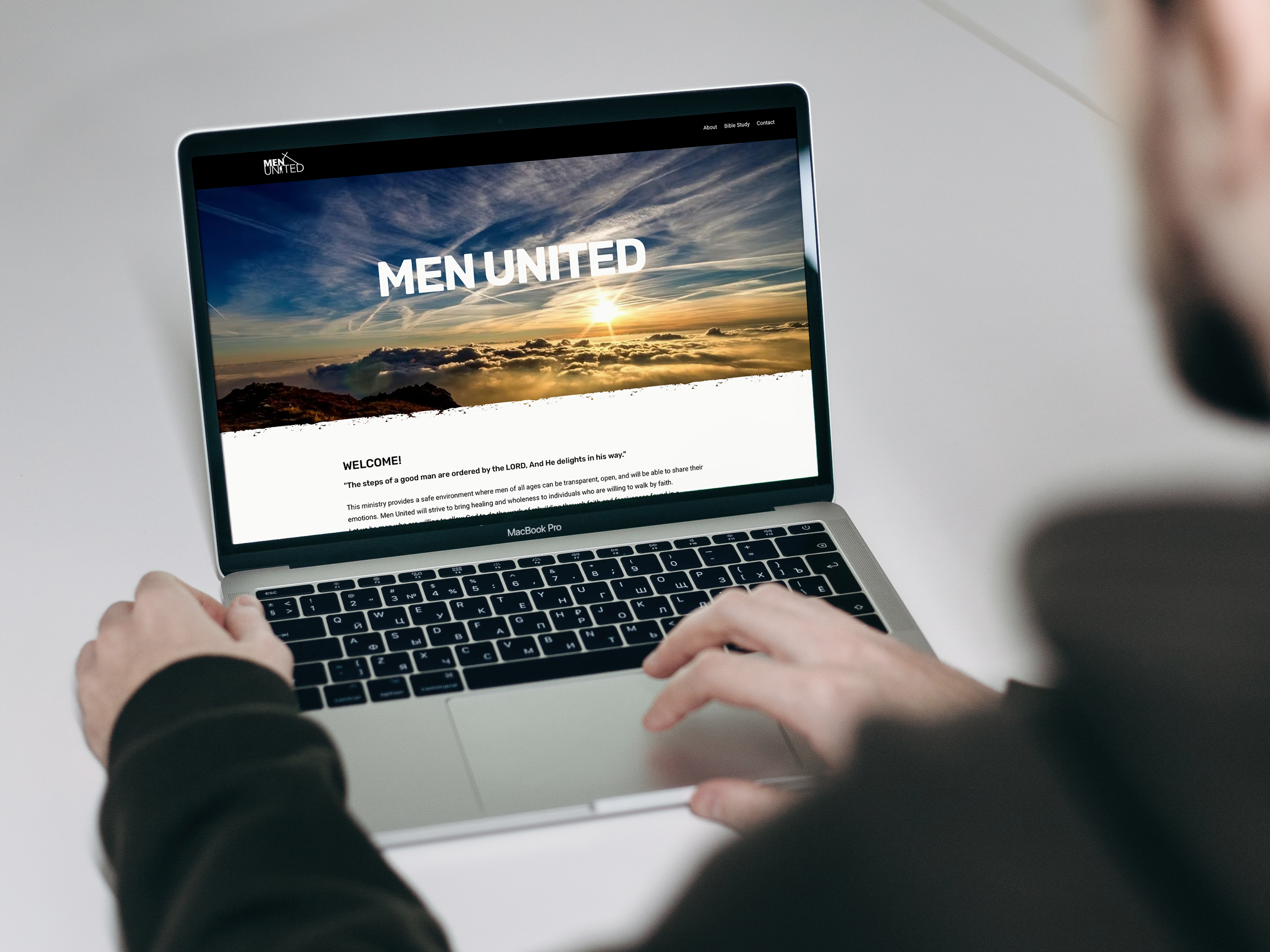
The website was created as the primary digital presence for Men United. The focus was on creating an easy-to-navigate experience that communicates the organization’s mission and encourages connection.
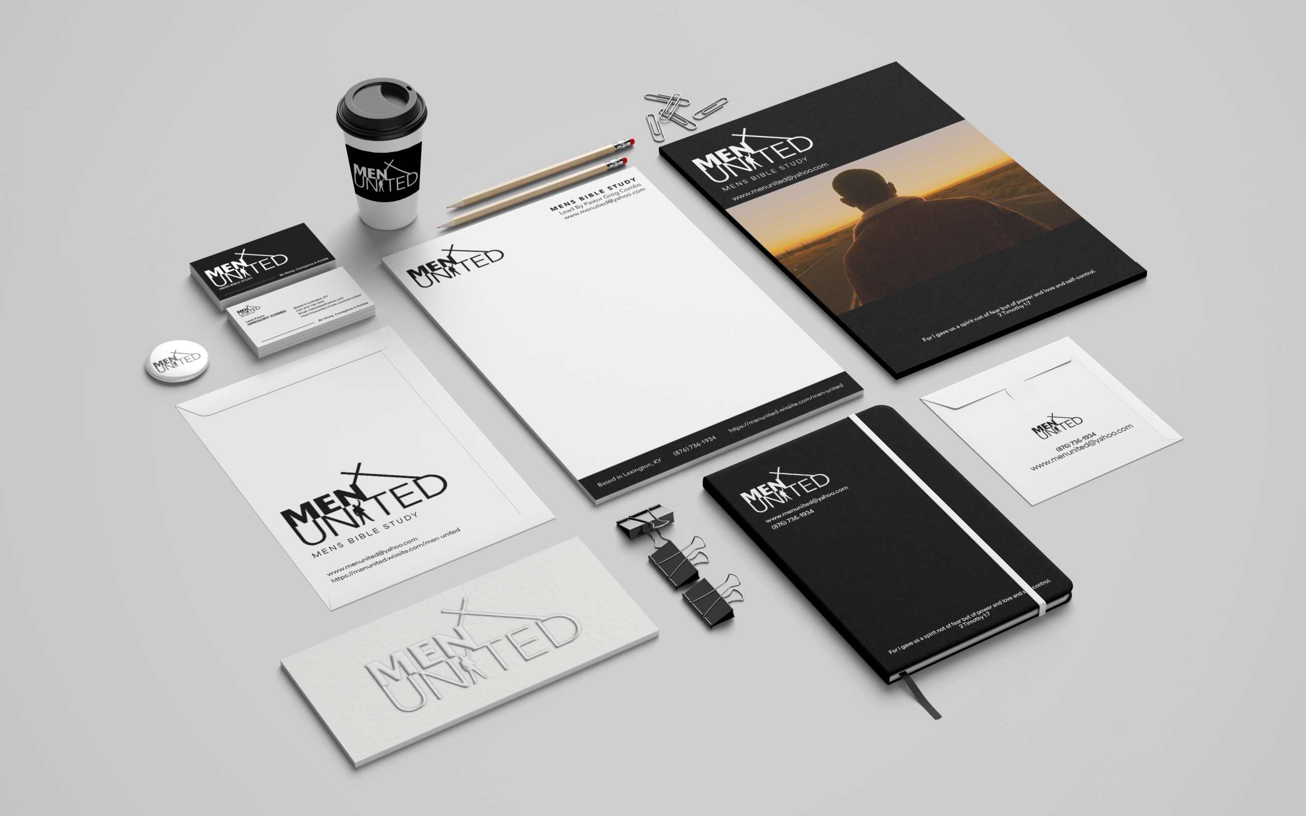
Business Cards & Stationery
Printed materials extended the identity into everyday communication and community outreach while maintaining a consistent professional appearance.
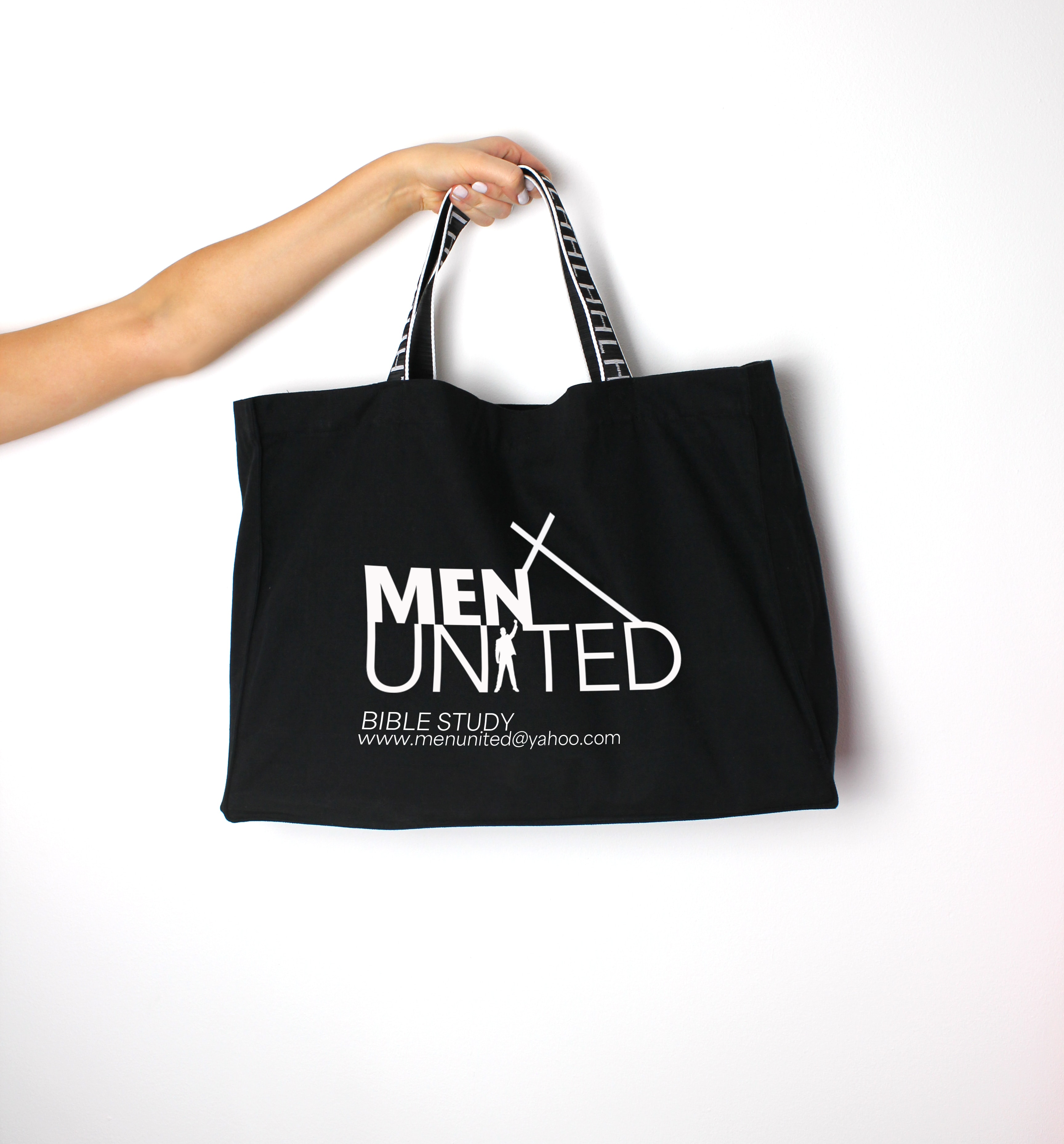
Branded Merchandise
The Men United logo was applied to a branded bag to show how the identity could extend beyond digital and print materials. The goal was to create a practical item that maintained brand consistency while allowing members to represent the organization in everyday settings.
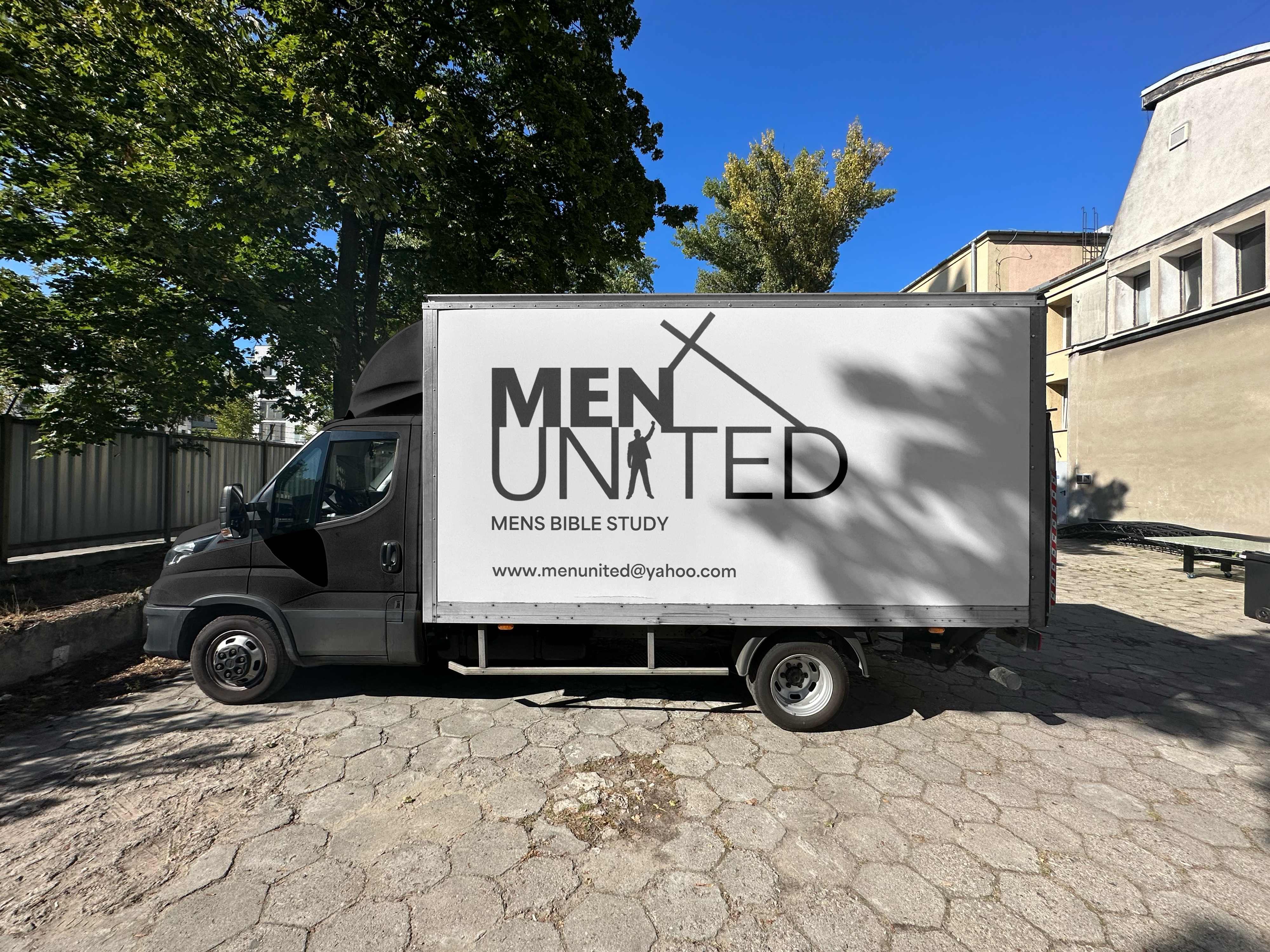
Vehicle Branding
The logo was adapted for vehicle graphics, extending the organization’s visibility and creating a recognizable presence within the community.
Outcome
Starting without an existing identity, this project explored how design could help establish a clear visual direction for Men United. The final identity creates consistency across digital, print, merchandise, and other materials while supporting the organization’s values of faith, strength, unity, and belonging.
Reflection
This project highlighted the importance of creating designs that connect with the people and purpose behind an organization. By focusing on the message and values of Men United, the identity was developed to feel meaningful and approachable. The project also allowed me to explore how a visual system can grow beyond a single logo, creating a foundation for future materials while keeping the overall look consistent.