
Clark Atlanta University
Overview
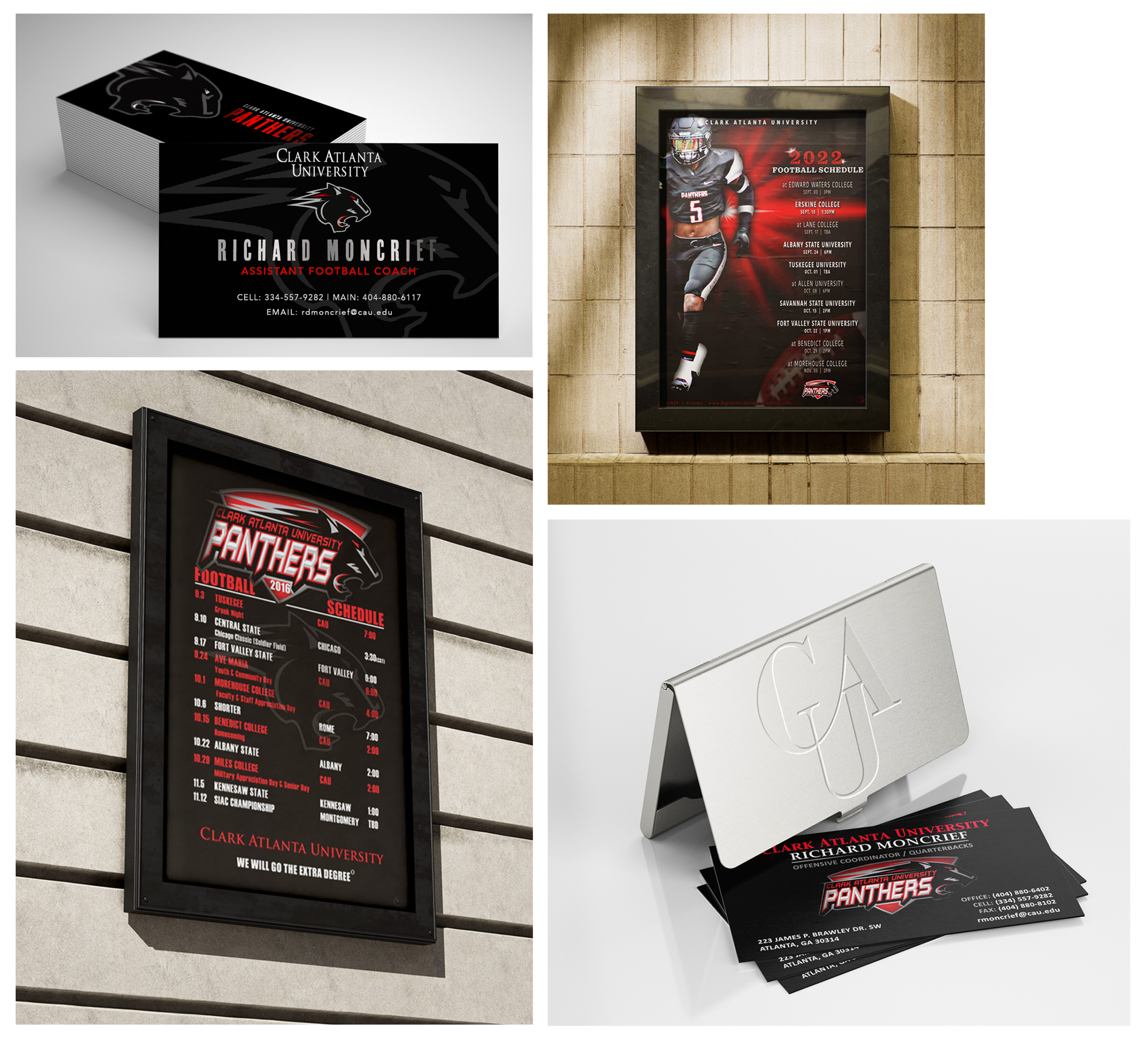
The project features a collection of print materials created for the Clark Atlanta University Football Department, including football schedule posters and business cards designed within the university’s existing athletic identity. Working with the established logo, colors, and visual elements, the designs focused on creating clear and engaging materials that aligned with the football program’s style and communication needs. Typography, layout, and composition were carefully considered to help organize information while reflecting the energy of collegiate athletics.
A luxury brand identity concept exploring craftmanship, minimalism, and timeless design.
The Challenge
The department needed print materials that would communicate information clearly while remaining consistent with Clark Atlanta University’s athletic identity.
The visual system needed to be:
- Reflect the energy and spirit of college football
- Work within the university’s existing brand guidelines
- Create layouts that present information in a clear and organized way
- Maintain a consistent look across multiple print pieces
- Prepare designs with print production requirements in mind
The focus was on creating materials that were visually engaging while remaining practical and easy to read.
Research & Discovery
Research included exploring examples of college athletics marketing, sports posters, and university print materials to help guide decisions around typography, imagery, and layout.
Several key insights guided the creative direction:
- Bold typography helps establish a strong visual presence.
- Action photography brings movement and personality.
- Clear hierarchy makes information easier to scan.
- Consistent layouts and branding elements help create a unified look across materials.
These observations helped shape the design direction, balancing the visual style of the program with the need for clear communication.
Brand & Strategy
The design approach focused on using Clark Atlanta University’s established athletic style as a foundation for creating clear and engaging print materials. Typography, composition, and layout were considered carefully to organize information while creating a look that felt current and connected to the football program.
Visual Approach
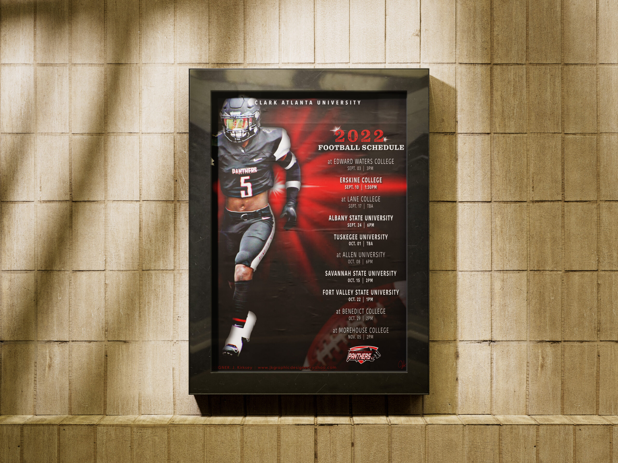
Bold typography, player imagery, and university branding elements were used across the posters to create a consistent visual style while keeping the schedule information clear and organized.
Hierarchy
Typography, spacing, and alignment were used to organize the information and create a clear reading order. These choices helped guide viewers through the schedule details while keeping the layout balanced and easy to understand.
Brand Alignment
The university provided the logo and color palette, while allowing flexibility with typography. The type choices were selected to work alongside the existing athletic brand and help create a consistent look across the promotional poster and business card.
Design Process
Football Schedule Poster Design
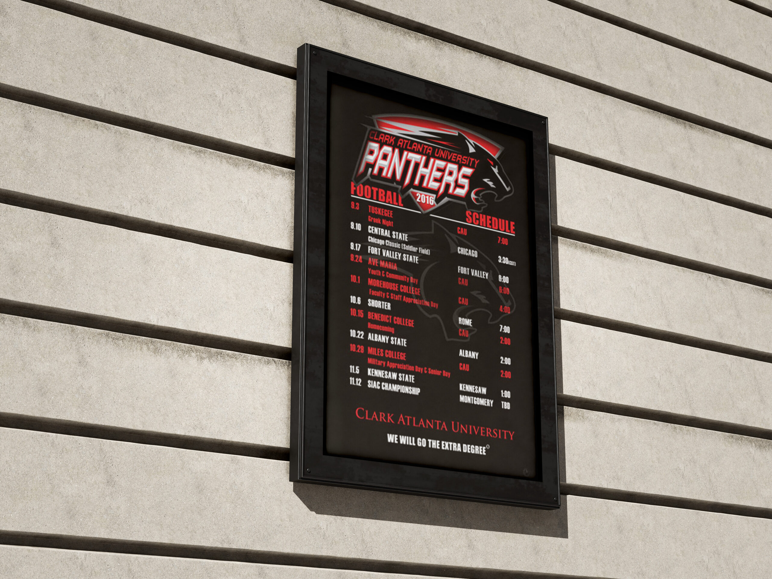
The football schedule posters were developed to communicate season information in a clear and engaging format while working within Clark Atlanta University’s established athletic identity. Multiple layout approaches were explored to find a balance between typography, photography, and information hierarchy, with the goal of creating materials that were easy to follow and reflected the style of the football program.
Business Card Design
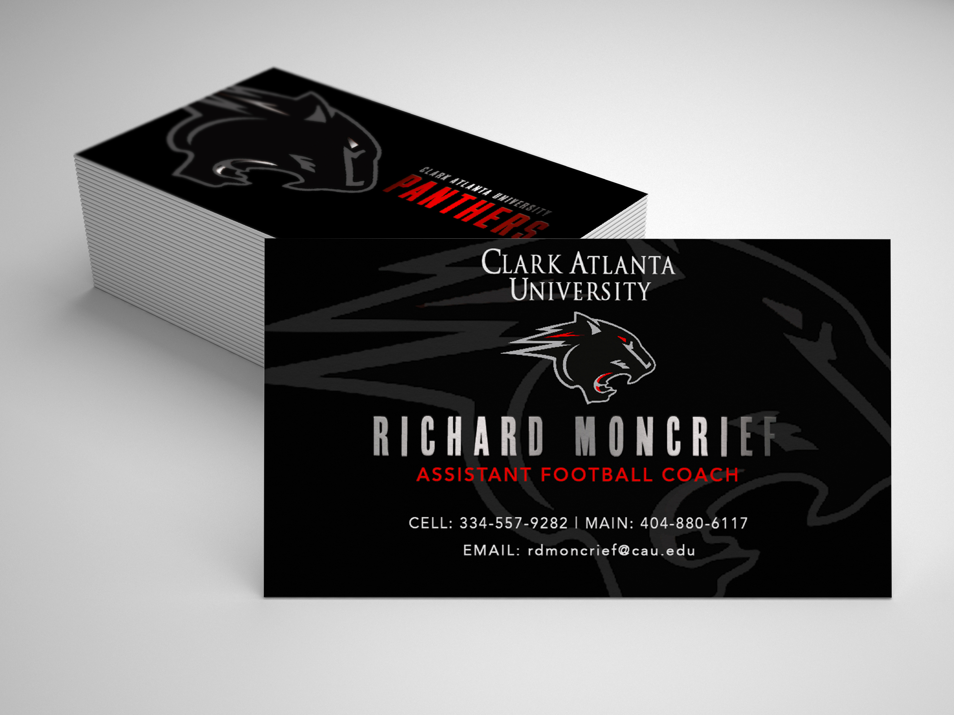
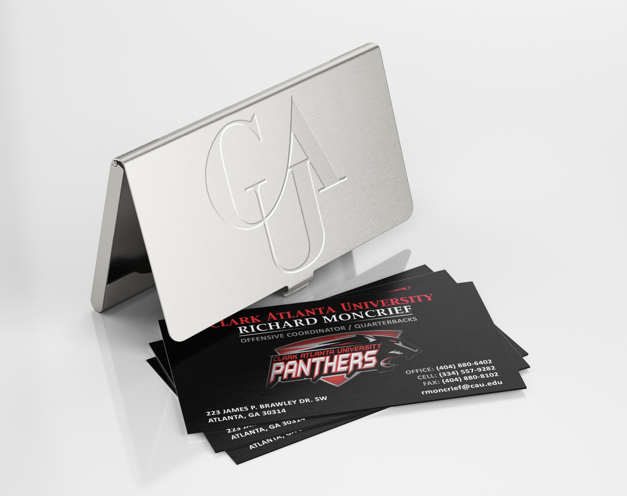
The business cards were designed to extend the same visual language into a professional format. Careful attention was given to typography, spacing, and alignment to create a clean, organized design that complemented the promotional materials while remaining practical for everyday use.
Visual Identity System
The posters and business cards were designed with shared visual elements to help create a consistent presentation, including:
- Bold typography to create a strong athletic style
- Use of the university’s existing colors and logo throughout the materials
- Clear hierarchy to organize information and guide the viewer
- Balanced layouts designed for different print pieces
The resulting materials work together as a unified visual system while supporting the football department’s existing brand identity.
Applications
Football Schedule Poster
The poster combines typography, photography, and existing brand elements to create an engaging promotional piece designed for season awareness and game information.
Second Poster
A second poster variation exploring the same visual direction while maintaining consistency with the football program’s established athletic identity.
Business Card Design
The business card extends the same visual language into a professional format, creating consistency across the football department’s printed materials.
Second Business Card
Additional card variations demonstrate how the visual system adapts across different professional applications while maintaining brand consistency.
Outcome
Together, the poster and business card create a connected set of print materials that support Clark Atlanta University’s athletic identity while serving different communication needs. The project explored how typography, layout, and composition could be used within established brand guidelines to create clear and consistent materials.
Reflection
This project provided an opportunity to work within an established brand while exploring typography, composition, and layout. Rather than creating a new identity, the focus was on applying existing brand elements in a way that supported the football department’s communication needs. The visual approach could also be extended to future materials such as recruiting pieces, game-day programs, social media graphics, and digital signage.