
The Posh Spot
Brand Marketing Collateral
A promotional print piece designed to communicate skincare services through a clean, refined visual approach.
Overview
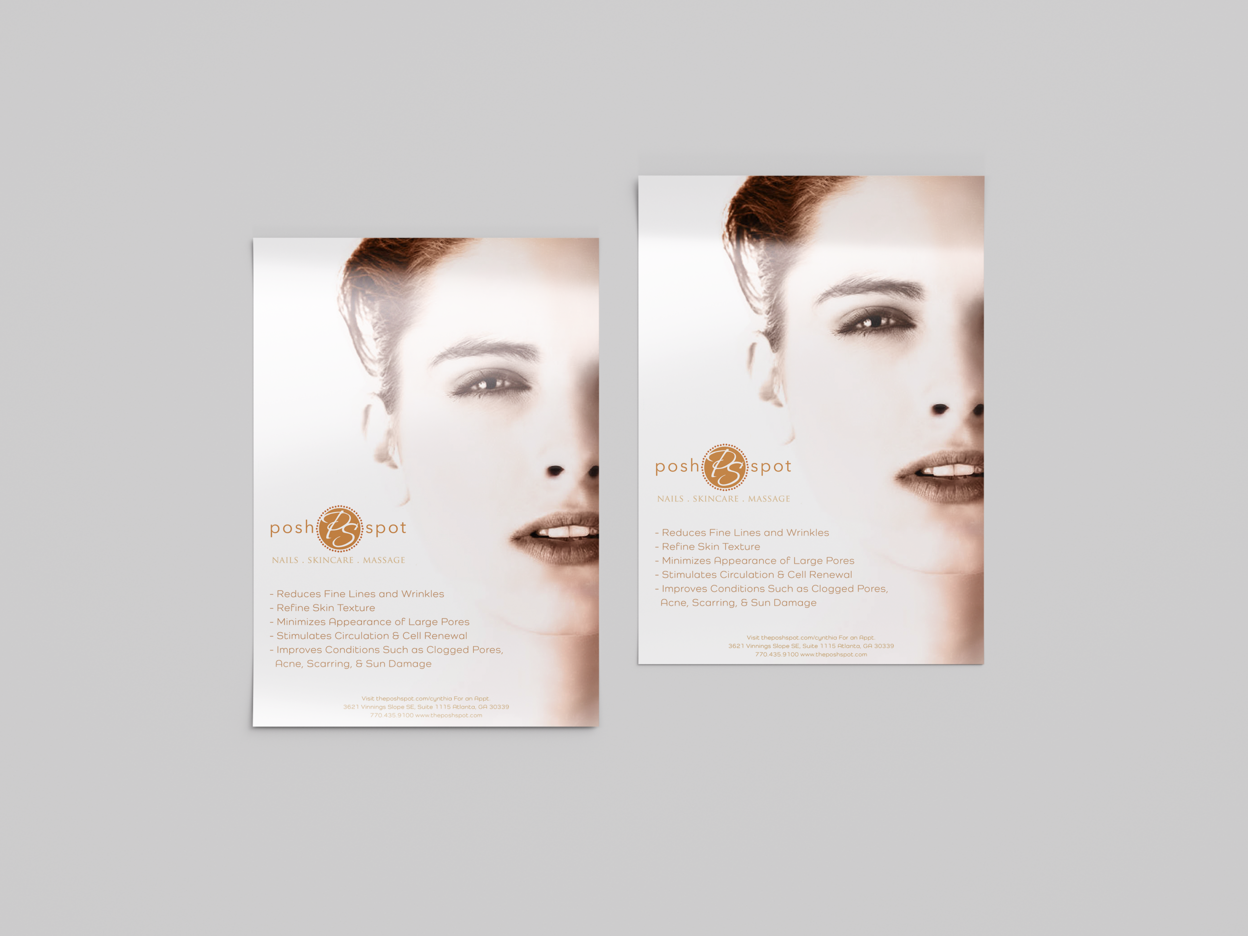
Posh Spot is a promotional print project created for a local beauty and wellness business. The objective was to design a flyer that presented the spa’s skincare services in a clear, professional, and visually engaging way while reflecting the calm, welcoming atmosphere of the brand. The final piece combines elegant photography with a simple layout and thoughtful typography to create a marketing piece that feels approachable, polished, and easy to read.
The Challenge
The goal of this project was to create a promotional flyer that showcased a variety of skincare services without overwhelming the viewer.
The visual system needed to be:
- Present service benefits in a clear and organized way.
- Appeal to clients looking for professional skincare treatments.
- Balance strong visual impact with readability.
- Reflect the spa’s clean, relaxing, and professional environment.
Finding the right balance between information and simplicity was key to creating a piece that would capture attention while remaining easy to read.
Research & Discovery
To help guide the design, I looked at marketing materials from spas, skincare brands, and wellness businesses to better understand the visual style and messaging commonly used in the industry.
Several key insights guided the creative direction:
- Photography was used to support the visual direction and highlight the subject.
- Clean layouts and white space were considered to create a simple and organized presentation.
- A restrained color palette was selected to complement the calm atmosphere of the brand.
- Typography was used to create structure and support readability.
These observations helped shape a design focused on clarity, balance, and simplicity.
Brand & Strategy
Elegance
A clean layout and understated typography create a refined look that complements the spa’s services.
Clarity
A clear visual hierarchy helps viewers quickly understand the spa’s offerings without feeling overwhelmed.
Balance
Photography, typography, and white space work together to create a layout that feels open, professional, and inviting.
Rather than following short-term design trends, the identity was designed with lasting appeal in mind, creating a look that can remain relevant as the brand evolves.
Design Process
The layout was built around a close-up beauty image to draw attention while reflecting the spa’s focus on skincare. From there, the typography was organized to guide the reader through the information in a clear and easy-to-read way, with careful attention to spacing and alignment. A palette of warm neutral tones complements the photography and helps create a calm, welcoming feel. Each design decision was made to support clear communication while maintaining a clean and inviting presentation.
Applications
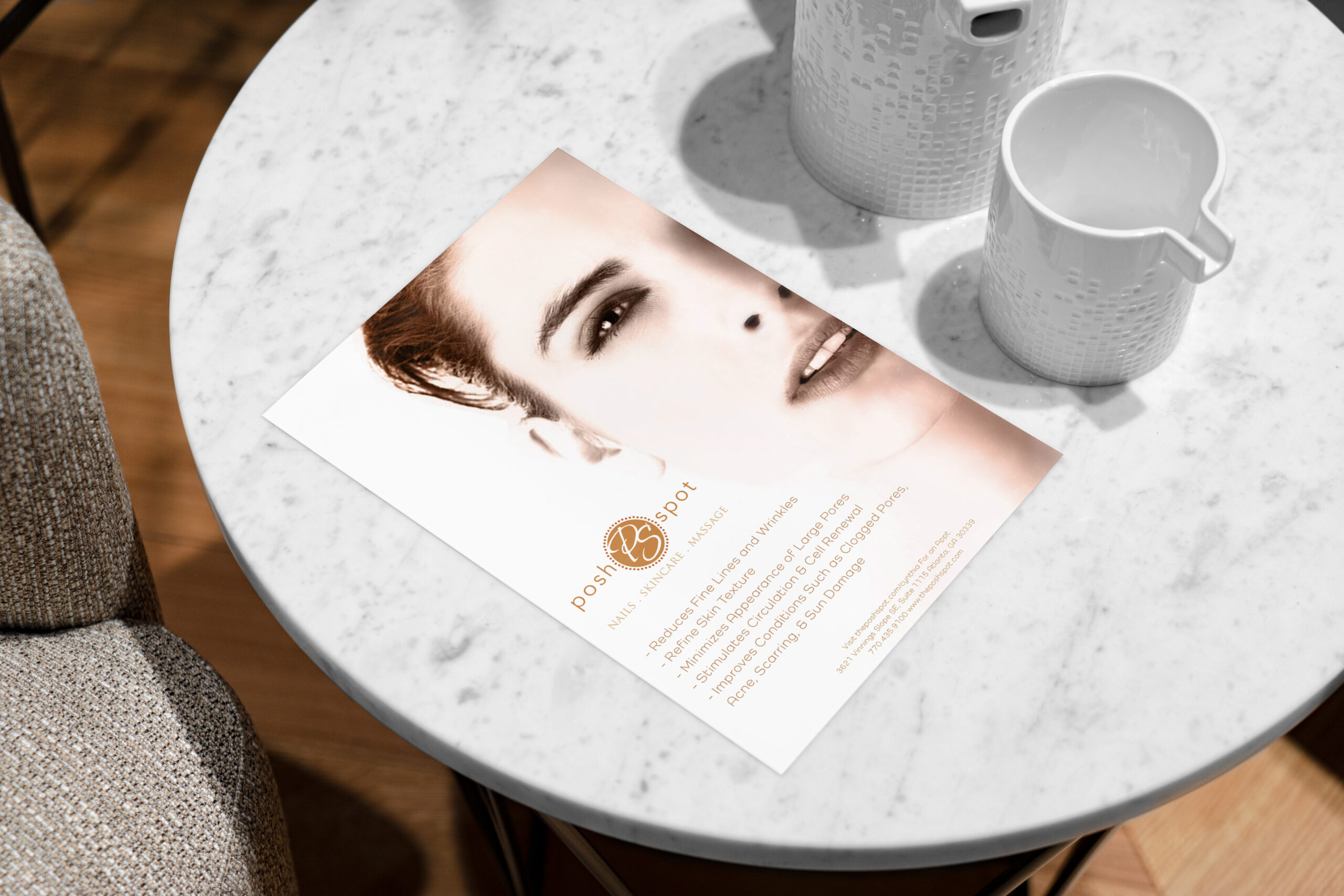
This flyer was designed to create an inviting introduction to the spa’s skincare services, using thoughtful spacing, soft visuals, and clear messaging to enhance the customer experience.
Outcome
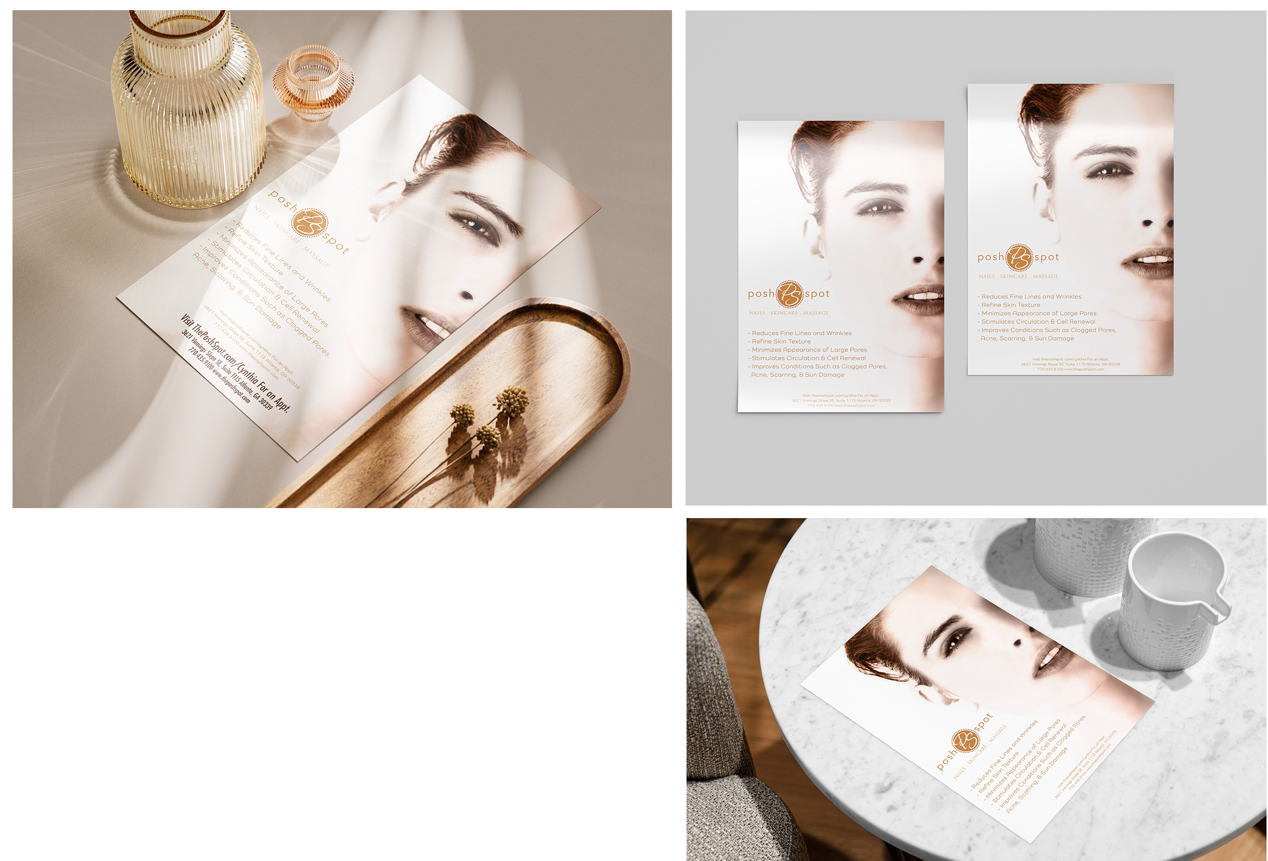
The completed flyer was designed to help the spa share its services in a clear and inviting way. By combining imagery, layout, and consistent typography, the piece creates a simple visual experience that supports the brand and makes key information easier for clients to find.
Reflection
Working on this project reinforced the importance of giving photography and typography enough space to communicate effectively. Rather than adding extra decorative elements, I focused on creating a balanced layout that allows the content to be easily understood. The project was a good reminder that thoughtful design choices can make a difference, even in smaller promotional pieces.