
Belmont Leather
Self-Initiated Luxury Brand Identity Concept
Overview
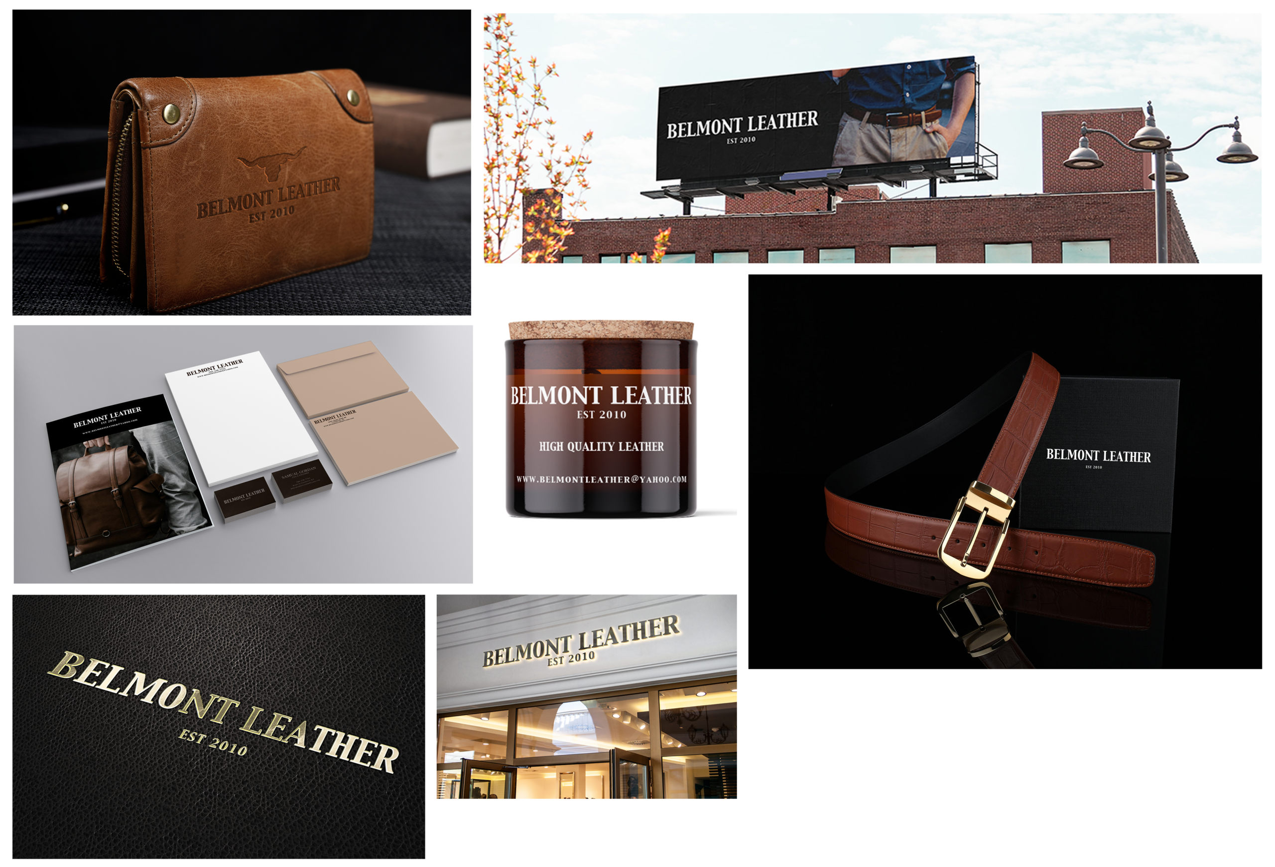
Belmont Leather is a self-initiated branding project exploring how a contemporary leather goods brand could be developed through a refined and consistent visual identity. The goal was to create a brand system that reflects craftsmanship, durability, and a modern sense of simplicity while allowing the identity to adapt across different materials and formats. The project includes a logo system and branded pieces such as billboard advertising, product packaging, stationery, business cards, and presentation boxes, showing how the visual direction can be carried across various brand materials.
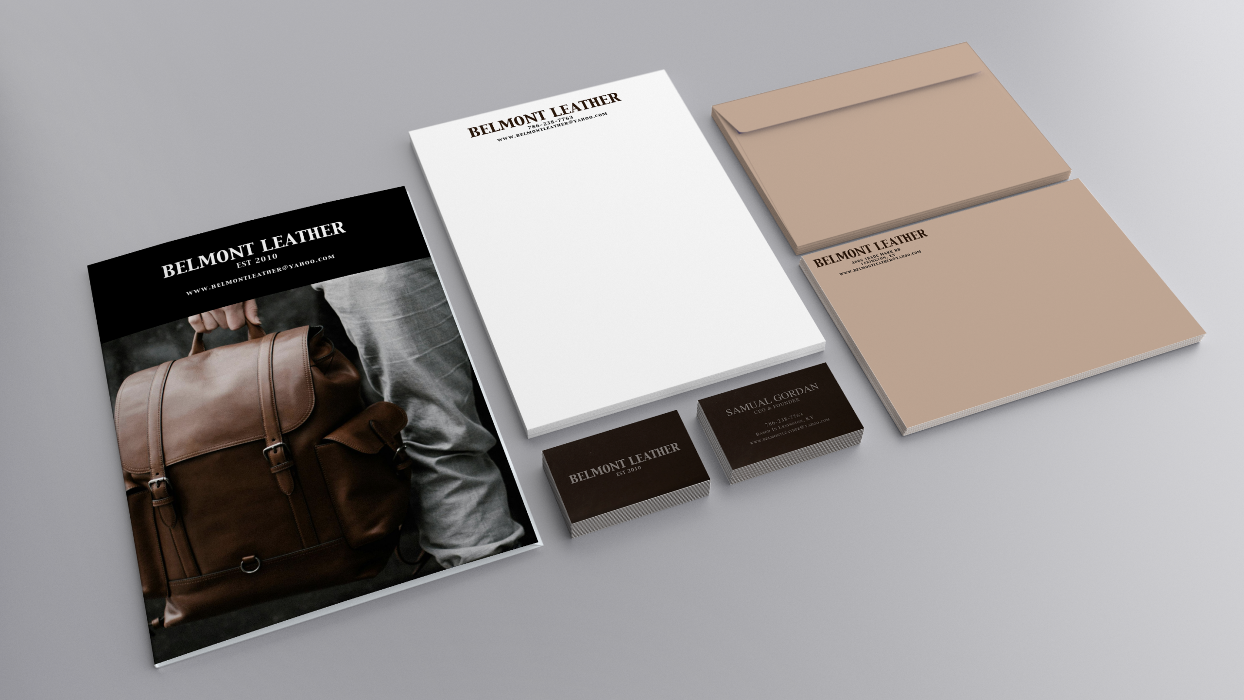
A luxury brand identity concept exploring craftmanship, minimalism, and timeless design.
The Challenge
The goal of this project was to develop a luxury leather goods brand identity from the beginning. Without an existing brand or visual foundation, the challenge was to create a visual direction that felt refined, intentional, and lasting while giving the brand a distinct character.
The visual system needed to be:
- Exploring how simplicity and restraint can create a refined brand presence
- Creating a minimal visual style with clarity and purpose
- Balancing detail and simplicity across packaging, print, and presentation materials
The project also provided an opportunity to explore how typography, spacing, and restraint can contribute to a refined visual direction while supporting the overall feel of the brand.
Research & Discovery
Research included reviewing luxury leather goods, fashion, and lifestyle brands to explore how typography, imagery, and visual details are used within premium branding.
Several key insights guided the creative direction:
- Luxury brands often use confident typography and restraint to create a distinct visual presence.
- Clean layouts and generous spacing can help create a more refined presentation.
- Consistent use of design elements across brand materials helps create a connected visual direction.
- Simplicity can be an effective approach when creating a premium and understated aesthetic.
These insights helped shape the visual direction by focusing on clarity, balance, and a refined approach to the brand identity.
Brand & Strategy
Strong typography and confident layouts establish a recognizable presence.
A restrained visual language allows the craftsmanship and quality to take center stage.
Careful attention to balance, spacing, and presentation choices were considered to create a sense of quality and consistency throughout the brand materials.
Rather than following short-term design trends, the identity was developed to remain relevant and elegant over time.
Design Process
The Belmont Leather logo was developed as a typographic wordmark with a focus on proportion, spacing, and letterform balance. Multiple concepts were explored by adjusting typography, weight, and alignment to find a direction that felt appropriate for the brand. The final mark uses a simple and understated approach to create a recognizable visual signature.
Visual Identity System
To ensure consistency across all brand materials, a simple and structured visual system was established, including:
- Typography used to create structure and visual balance
- Careful consideration of spacing and alignment
- Minimal graphic elements selected to maintain focus on the brand identity
The system was designed to scale effectively while maintaining a premium appearance.
Applications
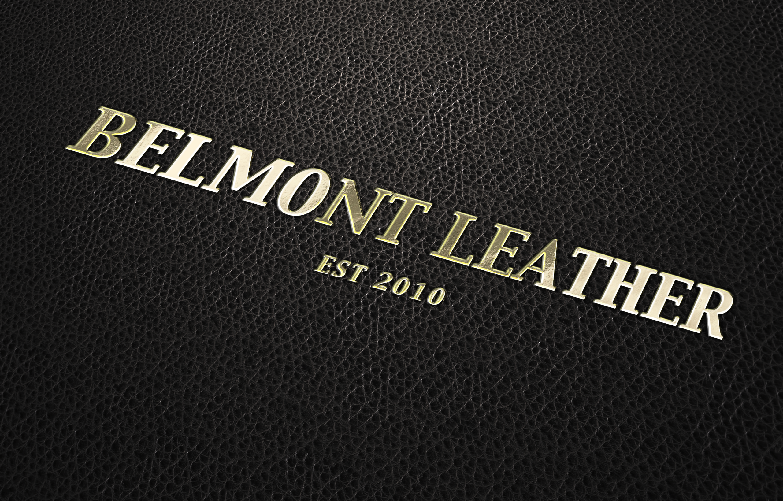
The Belmont Leather identity explores strength, craftsmanship, and simplicity through a bold typographic wordmark. Careful attention to proportion and letterform balance helps create a visual style that can be applied across products and brand materials.
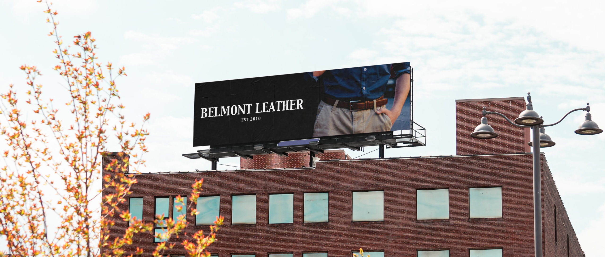
The billboard application explores how the identity translates to a larger format, using bold typography and generous negative space to maintain clarity and visual balance.
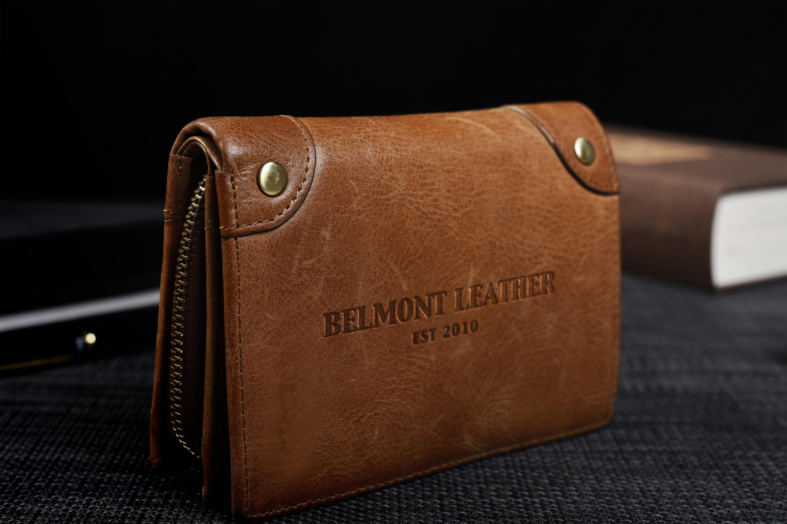
Applying the logo directly to leather explores how the identity can be carried onto the brand’s core products. The subtle embossing highlights the craftsmanship of the material while allowing the leather itself to remain the focus.
The stationery system carries the visual direction into printed materials through clean layouts, considered typography, and a simple approach to organization. The design was developed to provide a consistent and professional presentation for client communication and brand materials.
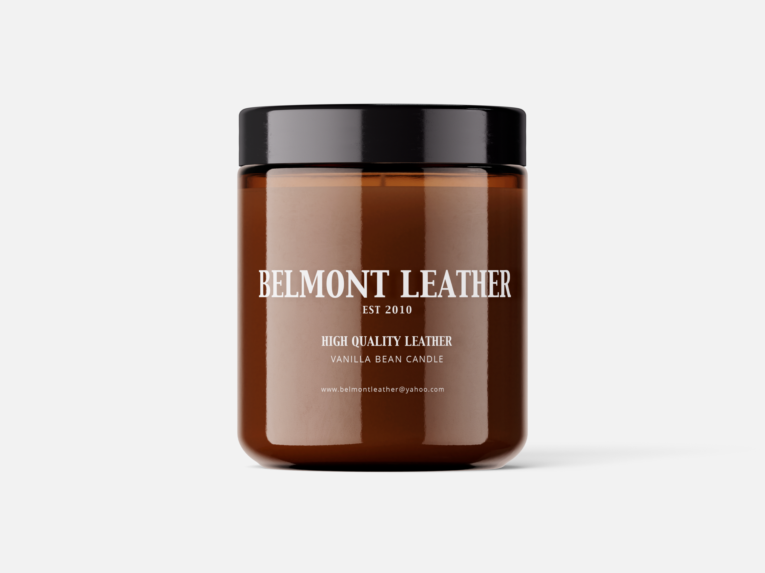
Although Belmont Leather focuses on leather goods, the candle concept explores how the visual direction could extend to a related lifestyle product. The label carries over the same typographic approach and understated style while allowing the product to have its own presentation.
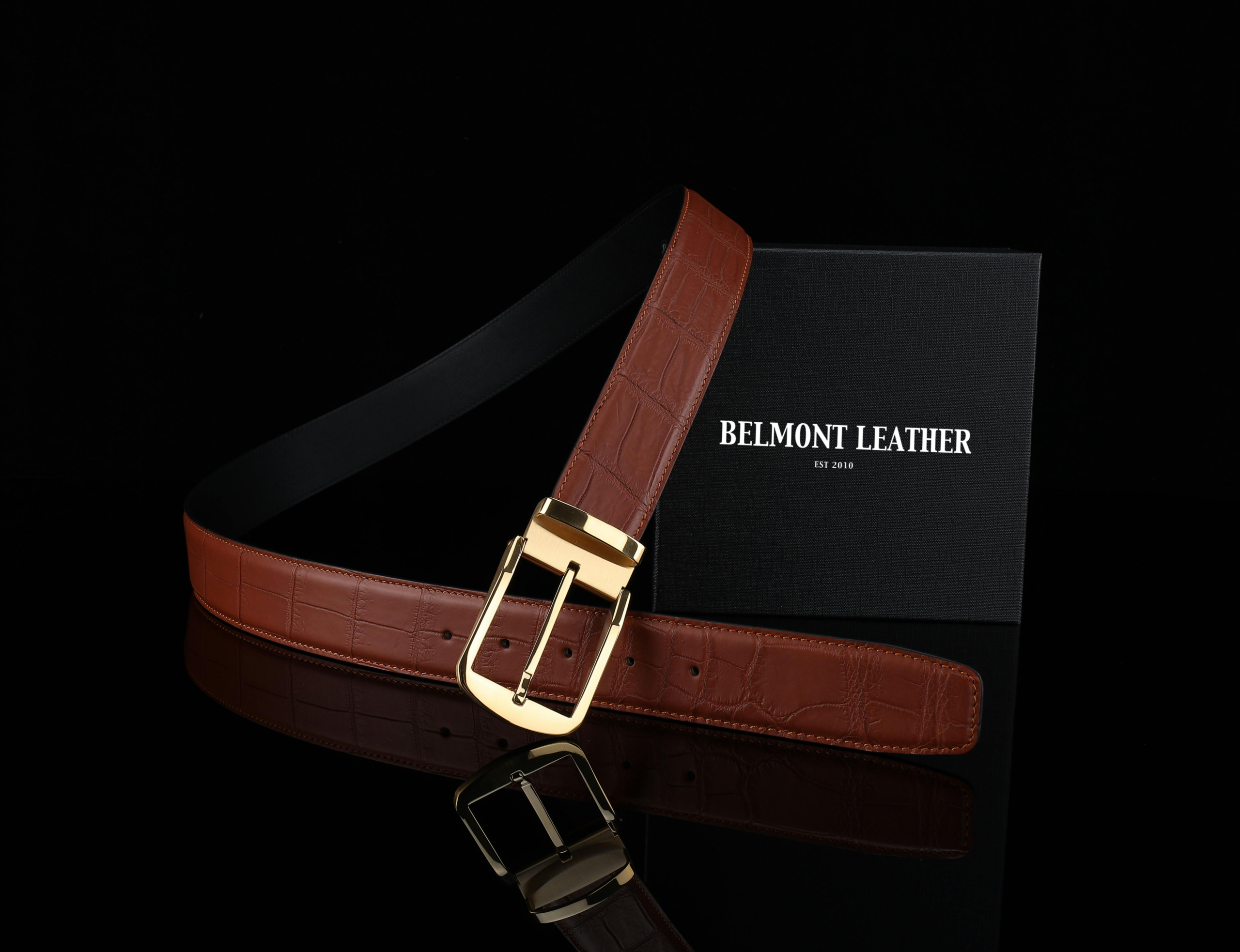
The presentation box and embossed belt explore how the visual direction can carry through to product packaging and details. Restrained branding and consistent typography help maintain a simple, recognizable look across the packaging and product.
Outcome
Together, these pieces show how the Belmont Leather visual direction was carried across packaging, advertising, stationery, and product materials. The project provided an opportunity to explore how a simple and restrained approach could be used in different formats while keeping the overall brand recognizable.
Reflection
This project provided an opportunity to explore the role of restraint in luxury branding. Working with typography, composition, and a limited visual approach helped me consider how simplicity can communicate a sense of quality without relying heavily on decoration. As a self-initiated project, Belmont Leather also gave me the opportunity to explore brand strategy, identity development, and how a visual direction can be carried across different materials.